Case study · 2025
Combobox Patterns (with TreeSelect)
A scalable combobox & TreeSelect pattern for the WooCommerce design system. Five approaches iterated, one direction landed, built to handle deeply nested hierarchies from shipping zones to product categories.
The challenge
The WooCommerce design system had no canonical pattern for selecting from deeply nested data. Shipping zones needed it (regions → countries → states); product categorization needed it (categories with arbitrary nesting); tag management would need it; and other surfaces would inherit whatever we landed on.
The originally proposed "TreeSelect" was essentially a Tree directly combined with a Combobox, a pattern not widely adopted in the industry, and one that introduced both usability and scalability challenges. The work was to figure out a general tree-handling pattern that could serve all of those surfaces consistently, and earn alignment from designers and engineers across the org.
Foundations: Tree, Select, Combobox
Before exploring patterns, I aligned with engineering on the vocabulary. Three foundational components in the system, each doing a specific job:
Tree. Items presented in a collapsible, tree-like structure. Navigable by arrow keys. Handles single or multiple selection.
Select. Behaves like a native <select>. Single or multiple selection.
Combobox. A text field combined with a list of items. Used for single or multiple selection, suggestions-as-you-type, or filtering through links and menu items.
Naming the parts was the smallest, most underrated decision of the project, every later conversation became cheaper because we agreed on the words.
What a combobox needs to support
I catalogued the four purposes the combobox would need to handle, drawn from real surfaces across WooCommerce:
Single selection. Pick one value from an allowed list, looks like a Select, but with a search field inside the popover so users can find values quickly without losing the currently-selected one.
Multiple selections. Pick several values, with chips for the selected items. Two valid patterns with different trade-offs: search in popover (chips sit above the search field), or search directly (chips sit inside the search field, removable with backspace and arrow keys). We support both.
Autocomplete. Free-form text entry with non-binding suggestions, the user can type whatever they want and the suggestions are convenience, not constraint. No persistent selection state.
Find item. Locate one item from a set, take immediate action on it (open it, navigate to it). The chosen item isn't "saved", useful for finding menu items or help links.
TreeSelect specifics
Once the combobox foundations were settled, the TreeSelect-specific challenges came into focus:
Hierarchy. A typical shipping case: All Regions → Region → Country → State/Province. Up to four levels deep, sometimes more.
Selection logic. Flattening the tree breaks the combobox model; a fully hierarchical display adds too much complexity. A parent node can select all its children. Indeterminate states show counts (e.g., 3/10 selected). Visual hierarchy reduces clutter, but only when handled carefully.
Search behavior. Users should be able to search across all levels of the tree, but showing results while keeping the hierarchy visible is tricky. This was the central tension the approaches had to solve.
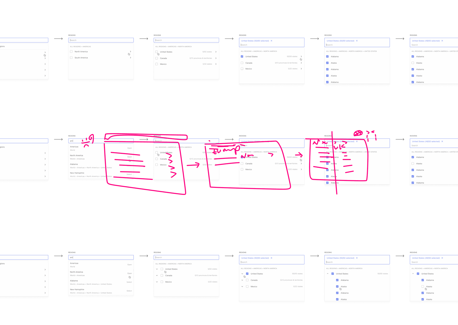
Five approaches, one decision
I explored five distinct ways to handle the TreeSelect search-and-select behavior, each modeled on or reacting to a real-world implementation:
Approach 1, similar to Shopify
Search returns countries with both their parents and children visible. Easy to select from the hierarchy directly, but quickly cluttered after a few levels of nesting because every search result has to render its surrounding hierarchy.
Approach 2, similar to Wix
All countries presented in a flat hierarchy. Simple cases work, but selecting larger areas like "Europe" forces the merchant to pick every country individually, doesn't map to our tree structure.
Approach 3, drill-down (the foundation)
The most scalable option. Drill into smaller subsections of the tree; handles more than three levels of nesting; resolves the display problem when search returns deeply nested items across different branches. A search for "am" can show the path: Americas → North America → United States → California.
Approach 4, permanent tree (GitHub-style)
Keeps the full tree visible like GitHub's sidebar. Works in wide layouts but breaks down in modals and other space-constrained surfaces.
Approach 5, layered breadcrumbs Chosen
Built on Approach 3, optimized to include layers represented by arrows, borrowing the breadcrumb concept. Merchants can select regions on the left with a checkbox, drill into layers to choose more specifically, or search directly. Subtrees support select/deselect all. Scales gracefully to more nested layers like product categorization.
In motion, both paths feel native: a merchant can click through the breadcrumb layers to drill into a region, or search directly across the whole tree and have the matching path light up at every depth. Subtrees support select-all and deselect-all, and the breadcrumb stays anchored so it's never unclear where in the hierarchy you are.
What the cross-team review changed
Sharing the proposal opened a thread of seventeen replies across designers, engineers, and product. Three pieces of feedback shaped the final direction:
"My only ask would be to define how the breadcrumb appears when it overflows the first line. Hopefully that won't happen often, but I could see it happening on narrower screens."
Jill Quek, designerBreadcrumb overflow. Jill flagged that "All Regions → Americas → North America → United States" would wrap on mobile. We agreed to revisit truncation and consider whether the breadcrumb should be a functional component (clickable to navigate up a level) or purely visual.
"I have some doubts about how the component will look and behave in modals. I wonder if it'll be preferable to make it more like a ListBox, making the dropdown always visible, for cases like the modal."
Ismael Martín Alabarce, engineerModal vs popover. Ismael's concern about clipping inside modals led us to add an "in-place ListBox" variant, the dropdown becomes inline rather than floating when the surrounding container can't accommodate a popover. Lena (engineering) confirmed it would be straightforward given the modular component structure.
"Would it make sense to omit the '(50/50 selected)' suffix when all options are selected? Are there country & province combinations or translations that might not fit?"
Andrew Duthie, engineerLabel length. Andrew's question about copy length, "Canada 0/13 provinces & territories" was already long, pushed us to explore shorter labelling options for fully-selected states without breaking consistency across the rest of the component.
What this work taught me
This project became a clear case for me of how much design-system work is writing. The Figma file mattered, but the alignment came from the words: defining Tree, Select, and Combobox up front; framing five approaches in a way that made trade-offs legible; recommending one direction with confidence and reasoning. Every iteration after the first proposal was easier because the vocabulary had landed.
The other lesson: cross-team feedback isn't a tax, it's the work. The seventeen replies didn't slow the project down; they made the final approach more durable. Each piece of pushback, breadcrumb overflow, modal behavior, label length, pointed at a real edge case that would have shipped broken otherwise.
Where it goes from here
- More alignments to bring in adjacent use cases (tag management, category trees in editors)
- Working with shipping engineering to unblock the rollout
- Inline-ListBox variant for modals and constrained surfaces
- Iterating breadcrumb truncation and the "all selected" label rule based on what merchants actually do