Case study · 2020–21
Remix App by Buffer
A mobile app that turns tweets, quotes, and screenshots into beautifully branded social images, saving brands and creators the Canva detour.
Problem statement
We saw plenty of users grabbing screenshots from Twitter and sharing them on Instagram, Facebook, or other social media. Brands would also share quotes, positive press, blog posts, and so on from various sources. But it was a tedious process: take a screenshot, upload to Canva or another design editor to get the desired look, finally post it.
The idea behind Remix was to ease the process: get text from a source, edit it, and post it on mobile. We aimed to speed up the flow and guide users, including target customers and brands building a consistent image for their sharing, to the Buffer app to schedule their posts.
Goals
- Downloads on both platforms (iOS & Android)
- Track weekly active users (WAU)

User flow & insights
Through user research, I mapped a typical journey for someone wanting to share a tweet on Instagram: tweet/link → screenshot → decide what size, a post or a story → upload on a design tool → edit in design → post. Six steps for what should feel like one. That was the friction Remix existed to remove.
From user stories: "When I want to post the content from Twitter to IG, I want to get the content by adding the URL so that I don't have to screenshot it and upload to a design tool like Canva." And: "When I grab screenshots, I want to edit it on my phone and then easily schedule it to post."
Design exploration, v1
Navigation: removing what isn't needed
In my first exploration, I had two key concerns: navigation and properties. The first iteration allowed users to launch Twitter within Remix. I quickly discovered this wasn't necessary, users started their actions from Twitter side, not by opening Remix first. They'd already be in Twitter, encounter a tweet to share, screenshot it, and then come to Remix. Users could also paste the URL directly via the share sheet.
In that early exploration, options for sizes, style, and background were hidden until a user pasted a URL and tapped "Create image." That hid the value of the app. I brought the three options out into the tab bar as part of the navigation. When a tab was selected, it guided users with Previous/Next buttons.
This seemed good at first, but actually created more confusion. Users didn't know how many more steps were coming. They thought they had to finish a series of steps to export. "Previous" was confusing because it might mean a previous step.
So I changed to a design that let the user know they could export the image right away. A main tab made it easier to insert URLs and prevented problems when the URL step was missed. Removing previous/next steps eliminated guessing about gestures and actions for selecting properties and exporting.

Edit & save colors
At first, the app provided some default colors in the custom background area to test whether they were helpful. After more research and reaching out to marketing managers, I found that brands stayed close to their brand colors and variations to keep a consistent brand image. This signaled custom color was likely a key feature, users would want to reuse brand colors across multiple images. After confirming with engineers that they had time, I added the feature along with an option to type in the exact hex code.
Another addition: when users pasted news or blog links, they could double-tap to edit the title to re-purpose the article for social engagement. Individuals and brands could see the value of being able to change the title, keywords, or tone to avoid repetition across their marketing channels.
Templates
To design the templates, I researched what users were doing today. I analyzed 50 business and personal brands to look for patterns in their posts. Common themes emerged for backgrounds:
- Custom backgrounds (brand pattern or image)
- Text on white background (for readability)
- Text on plain background
- Showing the source of quotes, mentions, or Twitter logo to make attribution clear
I designed all the templates with these themes in mind, especially wanting to make sure users could clarify where the image came from. And because users were able to change the background color, we were careful about color contrast applied to text on simpler backgrounds.

Highlights from v2
v1 launched on Product Hunt where we gained more user feedback and iterated for v2.
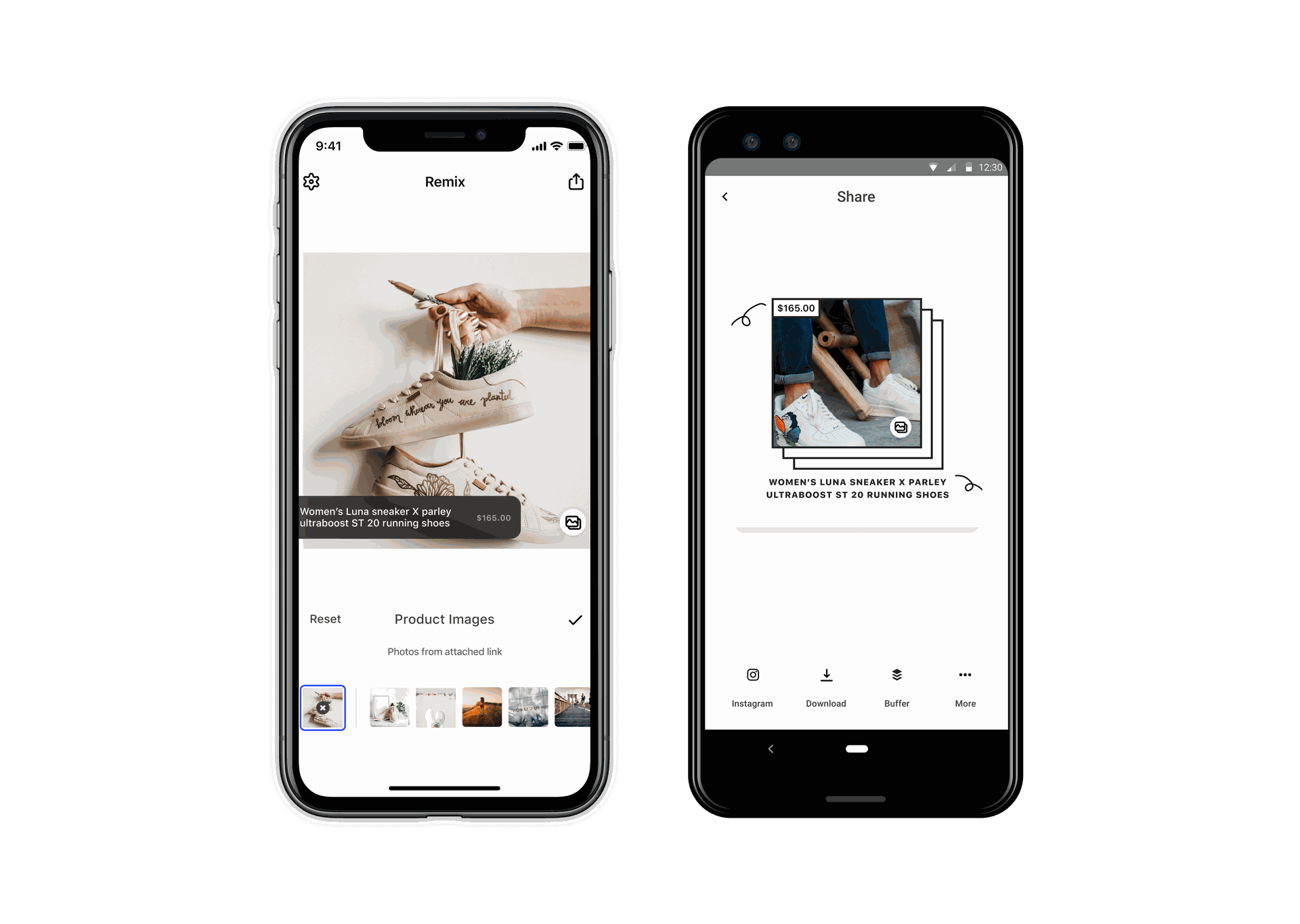
We discovered that for direct-to-consumer brands, it was important and valuable to be able to efficiently show their product across different social media channels. By incorporating Shopify, brands could go through their product list, select one, and share immediately if they wanted to cross channels to promote products quickly.
If they wanted to change product style, we also made a series of product templates for users to start with.
Onboarding
In designing the onboarding slides, I always thought about how this app could be marketed to the consumer side. I wanted to make it easy for users to understand what this app offered. I worked backwards and tried to focus on the key features I needed to single out to attract users' attention and give us a better position for the app.
One question we considered: should there be a login? We decided that for this part of the process, we wanted to bring values to users in the most straightforward way. Users didn't need to sign up or log in to use the basic features.
The outcome
#2
Product of the Day on Product Hunt at launch
~26K
Downloads in the first 12 months, exceeded our goal
1,000
Weekly active users, strong retention for a focused tool
We received great feedback from customers who felt their screenshot-to-post process was greatly improved. Six steps had become one, paste, edit, post.
Credits
The whole Buffer mobile team worked on this Remix project, two iOS engineers, two Android engineers, plus everyone who gave feedback and comments that shaped the app.