Case study
Input Validation for shipping
Refining the input validation experience for shipping label purchases, turning a fiddly, error-heavy form into clear, helpful guidance that respects the merchant's time.
Introduction
This project aimed to refine the input validation experience for users purchasing shipping labels. The goal was to provide clear guidance on required inputs, minimize user confusion and frustration, and avoid overwhelming users with premature or irrelevant error messages. This refinement aimed to make the label purchase flow smoother for merchants.
Goals
- Enhance the user experience by providing clearer guidance on required inputs.
- Minimize user frustration caused by dense text and numerous input fields.
- Implement an intuitive error validation system.
- Ensure the solution fits within the existing framework and time constraints of the MVP.
Problem statement
In the process of purchasing shipping labels, users need to input detailed information, package type, dimensions, weight, hazardous material declarations, customs details, to access service options and rates. The current design oversimplified this process, leading to potential user confusion and frustration due to dense text and numerous input fields.
Goal & expectations
Goal. Refine the input validation process to offer clearer guidance while avoiding premature error messages.
Expectations. Implement changes that improve user experience without significantly increasing engineering effort, and ensure the solution is sustainable within the existing MVP framework.
Design exploration across four iterations
Iteration 1, inline error banners and a dynamic checklist
At the start, we tackled the initial user confusion by introducing inline notice banners to provide immediate guidance on what actions users needed to take. The copy was updated for clarity, making it easier for users to understand the requirements. To handle errors, I proposed an error checklist that dynamically displayed input errors and directed merchants to the corresponding fields. This setup was designed to make the process less overwhelming by providing precise and actionable feedback.

Iteration 2, optimizing order details
Building on insights from the first iteration, the second focused on optimizing the display of order details. Key information such as Shipping from, Shipping to, and Shipping price were highlighted, while full order details became visible only once a shipping service was selected. This change was driven by space constraints and aimed to present critical information upfront without cluttering the interface.
The disabled button design was also adjusted to align with the WP library standards. We transitioned from a prominent red error box to a more subtle approach, grouping related issues within their respective sections to reduce the need for users to interact with each error individually. This iteration emphasized a less intimidating and more user-friendly error presentation.

Iteration 3, refining the info box
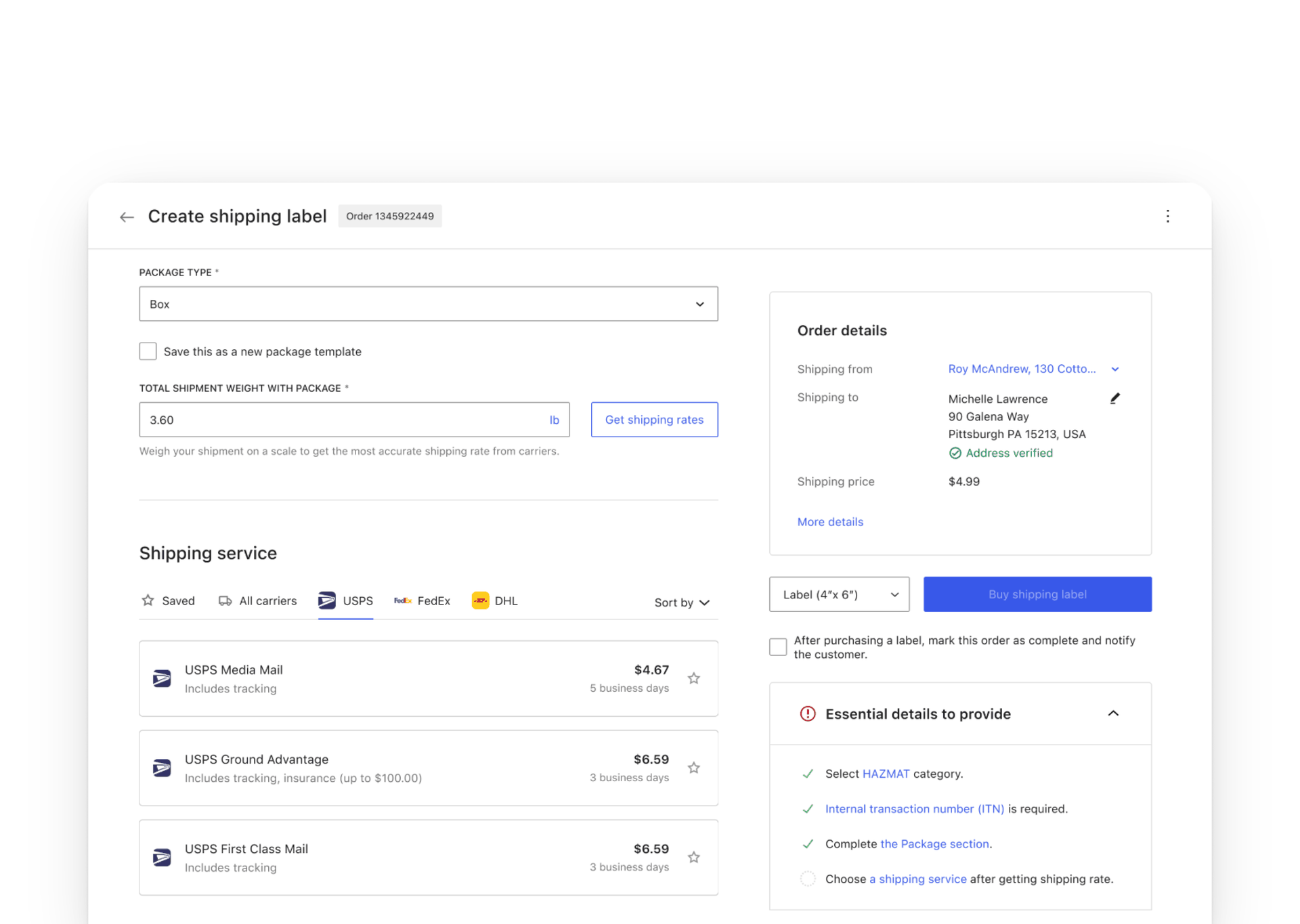
In the third iteration, we focused on refining the info box to enhance the experience further. The info box color was changed to a soft yellow to draw attention without causing intimidation. The error messaging became more informational, guiding users through the process step-by-step.
Visual indicators were introduced: a gray dot signified needed information, turning into a green checkmark once the input was successfully provided. The interface was simplified by removing the error count display, making it less overwhelming. This iteration was crucial in balancing the need for visibility with user comfort and clarity.
Iteration 4, final refinement
In the final iteration, we aimed to fine-tune the design with minimal engineering effort. The collapsible info box was further refined to ensure it guided users effectively while maintaining a clean interface. The behavior of the HAZMAT checkbox remained consistent, with added emphasis on legal compliance through persistent visual reminders. User interactions with new visual elements were tracked to ensure their effectiveness and make adjustments as needed. This iteration focused on delivering a polished user experience, ready for broader implementation.
We also added the HAZMAT area to the crucial information required, preventing oversight by prompting users to declare necessary items by selecting the appropriate category. Users can revisit the relevant section by clicking the associated link after a task is completed and marked with a check, allowing merchants to quickly review and confirm they've completed all necessary steps accurately.

The outcome
The iterative design process for input validation aimed to enhance the user experience by providing clearer guidance and minimizing user frustration. Key outcomes:
- Improved guidance. Inline notices and updated copy provide better guidance on required actions.
- Error management. The introduction of an error checklist and refined error messaging helps users correct mistakes efficiently.
- User-friendly interface. Optimized display of order details and collapsible info boxes create a more streamlined and user-friendly interface.
- Consistency & accessibility. Alignment with WordPress library colors and added tooltips ensure consistency and accessibility.
User testing
"The checklist def helps to see what I am missing and use it as a reference."
User testing participant
Conclusion
The iterative design process for input validation aimed to enhance the user experience by providing clearer guidance and minimizing user frustration. Each iteration brought us closer to a more streamlined and intuitive interface, effectively addressing both user and stakeholder feedback.
User testing validated our design choices, highlighting the practical benefits of the checklist and other improvements. Despite this being the final iteration for now, there is always room for further enhancements, we have identified some fixes in the backlog to improve the experience and adjust the checklist hierarchy.
This project shows the importance of collaboration and continuous feedback from engineers, product leads, and teammates. Their involvement was crucial in refining the design and ensuring its success. As we move forward, these foundations will guide us in making further refinements and maintaining a user-centric approach.