Case study
A moment of joy on the most ignored screen in the app
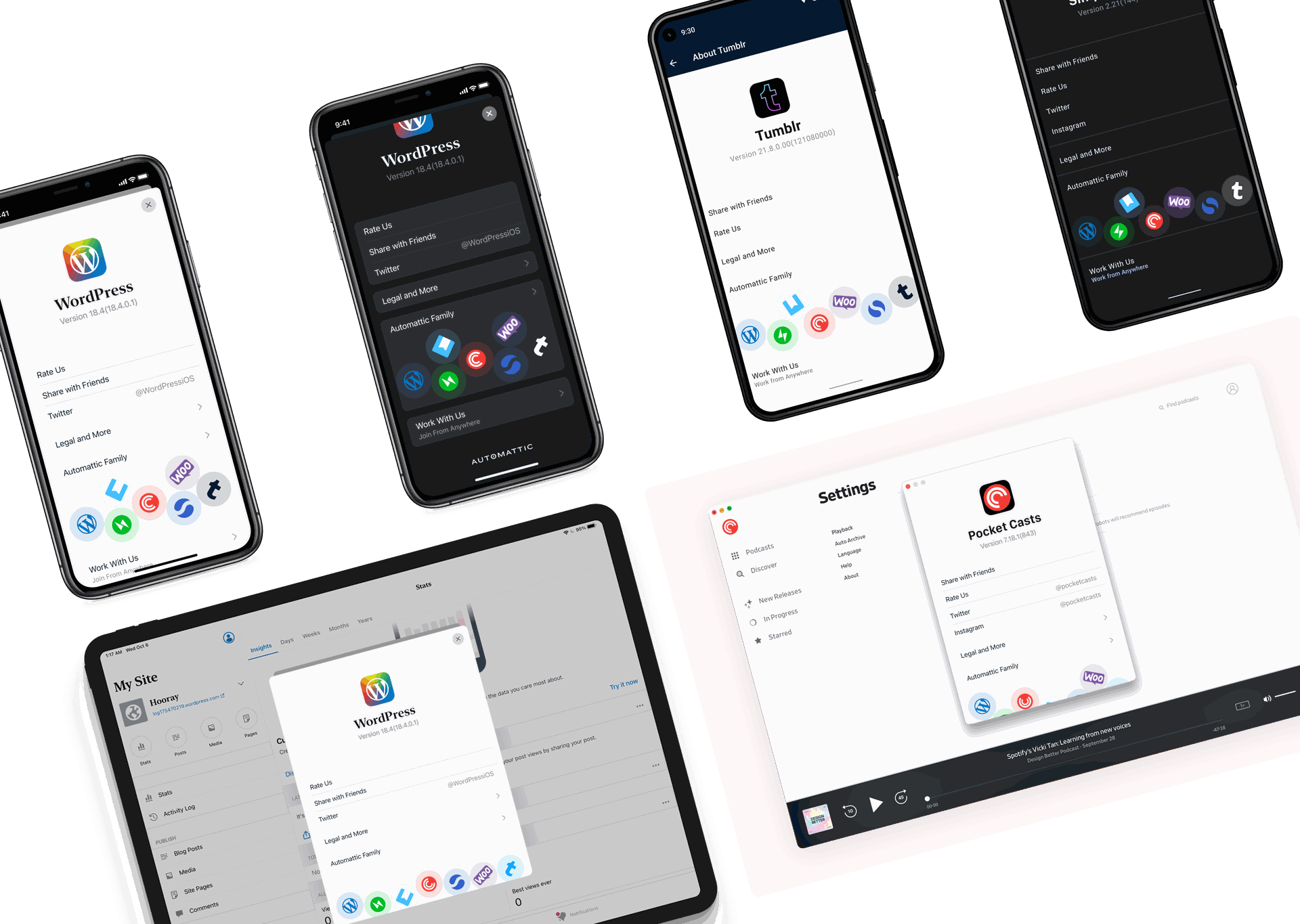
Unifying the About screen across every Automattic app, and slipping a physics‑based marble interaction into the most overlooked surface most users never notice.
The brief
The About screen is usually an afterthought. Static legal text, a few support links, the version number nobody asks for. But for Automattic, with a portfolio of seven very different apps, it was a missed opportunity. Every product had its own version, some had no About screen at all, the design felt disconnected, and there was no way to introduce people to the rest of the ecosystem.
We asked the question: how can we make this overlooked screen consistent across products without flattening each app's personality, and is there room for a moment of joy in there?

The marble concept
I auditioned three structural directions and the team landed on a clean list with the app icon, version, and key actions, plus a footer that could carry the Automattic brand. With the structure settled, the visual question opened up: what if the Automattic family of apps wasn't just listed, but was something you could play with?
That's where the marbles came from. The app logos behave like marbles in a container, with a physics simulation tied to the device's accelerometer. Tilt your phone and the WordPress, Jetpack, Tumblr, Pocket Casts logos roll around, bump into each other, settle. Subtle haptic feedback on the bumps. No tutorial, no instructions, just a tiny invitation to fidget with your About screen.
I also explored richer directions, photographic backgrounds, rounded square icons, layered illustrations, but they felt busy and competed with the actual content. The marbles delivered the playful touch without sacrificing the clean information hierarchy underneath.

Why it mattered
The unified template shipped across Automattic apps starting with WordPress and Jetpack iOS. The structural goals landed, more consistent brand experience, real cross‑promotion across the product family, a proper "Work With Us" entry point. But the part that kept coming up in feedback was the marbles. Engineers, PMs, and designers across teams kept mentioning them as the moment that turned what could have been another utility page into something people actually noticed.
This is the project I think about when someone asks whether design has room for delight on serious software. The About screen is exactly the kind of place a thoughtful design system would say "don't waste effort here." But every screen in your product is a chance to make someone smile, and the most overlooked ones are often the cheapest places to do it.
Credits
This shipped because of the iOS and Android engineering teams who took the marble simulation seriously, product and team leads across every Automattic product, and the designers and developers who pushed back, shaped, and adopted the template across their apps.